Will I get Avid Art 2 to launch on January 1st 2014? That is the plan.
Sometimes plans go awry but then sometimes they don't.
Tuesday, December 31, 2013
Saturday, December 28, 2013
Villa Riviera Backside

"Villa Riviera Backside"
oil on panel, 2013
6" x 4" (15.24cm x 10.16cm)
For sale at DAILY PAINTWORKS
Direct link to painting here
The fascinating Villa Riviera in Long Beach California.
I have painted this building a couple times already and always had plans to get back to it. I still don't have clear in my head what exactly I want to do with it or how to portray it. Doing these smaller studies will help me see and decide before doing a larger version.263
12/30/13 I've added this update below:
Two other paintings of Villa Riviera here and here.
*This one gave me fits when I photographed it. I will have to reshoot and repost the image.
**12/29/13 I've updated a more accurate image.
Monday, December 23, 2013
Seascape Dark Rock Study

oil on panel, 2013
5" x 7" (12.7cm x 17.78)
In my recent seascape studies here is an oil painting. The dark rock against all the white boulders made for a good study in the colors of white on a bright sunny day. I pushed the saturation quite a bit on this one.
If one like this makes it to a larger more finished version I may likely pull back a bit on the saturation. Part of experimenting is pushing things to really find out what can be done. This allowed me to focus on the color cast of each area.262
*I photographed this painting while wet so most of the white specks are glare highlights. When dry I will rephotograph.
*12/28/13 I've uploaded this more accurate pic. Gone are the white highlight specks. Any left are the white of the board showing.
Friday, December 20, 2013
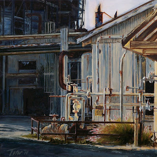
HB Power Plant Backside

watercolor on paper, 2013
6" x 9" (15.24cm x 22.86cm)
For sale at DAILY PAINTWORKS
Direct link to painting here
The Huntington Beach Power Plant may be getting torn down soon so I present it from its backside and in the background, the marine layer moving in to engulf it, a device I have used before to indicate an eventual disappearance from the landscape. We get so used to some landmarks around us they become a fixture in our lives and we will notice them more when they are gone one day.261
*The color of this pic is a little off, a bit too pink, but when it leaves my photo editing app it looks right.
Wednesday, December 18, 2013
Seascape Tide Pools 2

watercolor on paper, 2013
6" x 9" (15.24cm x 22.86cm)
For sale at DAILY PAINTWORKS
Direct link to painting here
Here is another exploratory seascape. I am doing these in preparation for larger works.
As I experiment with light, atmosphere, seasons, palette, design, moving the horizon up and down etc, I will begin to hone in on one or more series within the larger seascape motif.
This one and the previous "Seascape Tide Pools" both are fair weather versions.260
Tuesday, December 17, 2013
Seascape Tide Pools

watercolor on paper, 2013
6" x 8" (15.24cm x 20.32cm)
For sale at DAILY PAINTWORKS
Direct link to painting here
One of my goals for 2014 is to do more seascapes. I am beginning to do these smaller watercolors to search out what direction I will take with them. In this painting, at low tide, the tide pools remain relatively calm even when there are waves.
I am sure I will do others of these tide pools since the rocky pools offer some great patterns.259
Monday, December 16, 2013
Train Bridge Study

watercolor on paper, 2013
4" x 6" (10.16cm x 15.24cm)
For sale at DAILY PAINTWORKS
Direct link to painting here
This is a small close-up study of a train bridge over the Los Angeles River. I love the submarine-like shape of its foundation.
I will at some point paint one or more larger versions of this bridge.
Doing studies helps familiarize myself with the complicated structure of this bridge which crosses the river at an angle instead of at 90 degrees. That means there are more angles to work out the perspective of, in fact hardly any 90 degree angles at all.258
Friday, December 13, 2013
Press Telegram #2 - Pile
%22DavidJTeter.jpg)
watercolor on paper, 2013
5.5" x 7.5" (13.79cm x 19.05cm)
For sale at DAILY PAINTWORKS
Direct link to painting here
This is what was left of the Long Beach California Press Telegram, a pile of rubble.
Shoveled into a nice neat pile is the remains of peoples former lives. The paper itself, as it once was, is the story now.
Like many of my industrial subjects the fascination here is all the various shapes.
Whether it is a pile of debris or a hillside in nature does not always matter to an artist. Instead we focus on its artistic values. So this is more of a study for the series. When I figure out what else to say I will use this for another painting.257
"Press Telegram #1" here.
Thursday, December 12, 2013
Old House - Zorn Palette
%22DavidJTeter.jpg)
watercolor on paper, 2013
5" x 7" (12.7cm x 17.78cm)
DAILY PAINTWORKS
Direct link to painting here
This is another in Anders Zorn palette of ivory black, white, yellow ochre and vermillion.
This I did from the photo on the DPW Challenge. I normally don't use someone else's photo but I did like the old abandoned house and they shot the pic from a good angle.
I am finding out by these two that the Zorn palette does not really translate well into watercolor (see last post). For one the ivory black does not give a very good cool blueish gray when mixed with white. I very rarely use tube black in watercolor or oil, preferring to use a chromatic black mixed from ultramarine or cobalt blue and burnt sienna.
Also white mixed into watercolor acts very different than white mixed into oil.256
Tuesday, December 10, 2013
Seascape - Zorn Palette
%22DavidJTeter.jpg)
watercolor on paper, 2013
5" x 7.5" (12.7cm x 19.05cm)
For sale at DAILY PAINTWORKS
Direct link to painting here
Here is a small watercolor seascape done in Anders Zorn limited palette of ivory black, white, yellow ochre, and vermillion.
The challenge of course was no blue for sky and water. No matter though. I used the white with black to get a cool gray for the distant clouds, black with yellow ochre to get a green gray for the water and generally saved mixes of vermillion and yellow ochre for the rocks. There were a few mixes of three colors but that was for subtly in keys areas, primarily to help turn form.255
*If you saw this previously the color was too warm. I've uploaded a more color accurate pic. 12/12/13
Monday, December 9, 2013
Little Seascape

"Seascape - Cliffs"
oil on panel, 2013
5" x 3.5" (12.7cm x 8.89cm)
Framed
For sale at DAILY PAINTWORKS
Direct link to painting here
Aaah, the marine layer, coastal fog, it is what makes for dramatic light and color.
It is near the perimeter of coastal fog that the deep rich colors live, before they die under its gray canopy. The landscape begins to fall into shadow but there is still enough sunlight to rouse color saturation.254
Saturday, November 30, 2013
Series - Locomotive, PHL 72 Limelight

oil on panel, 2013
5" x 7" (12.7cm x 17.78cm)
This painting will be featured at Segil Fine Art Gallery in Monrovia California for the Eleventh Annual Holiday Small Works Show.
Opening night is Saturday, December 7th, 2013, from 5-7:00 PM
It is another from my latest locomotive series.
I'm not only using this series to experiment and put down paint in different ways but also looking to make each painting unique in some way, never losing sight of capturing the Southern California light I see everyday all year long.
This was one of those glory moments. I was down in the LA Harbor area and spotted this PHL locomotive towing its prize.
I chased it down, caught it just as it switched tracks, raced back around the corner to get a better position and was just in time to catch it backing up as it passed the lime colored fence. The low-angle afternoon light illuminated the lime green fence, literally and figuratively like a limelight, and since (shiny) black is so reflective... well, you can see.
To further enhance that moment and more importantly my impression of it, I painted the light of a thinly veiled marine layer into the painting for a beautiful atmospheric effect. Gentle, soft, low-slung bright light making long shadows.
I rarely paint a locomotive without having a point of view. No, no, no.
I always see first, the painting in all its totality, then one of a locomotive in its environment. It would be short-sited and do no justice to these mules of the harbor to do a mere depiction of it.
They are the true stars of the harbor. Not the huge bloated 'fat cat' cargo ships waiting to be unloaded, not the pretty white cruise ships with all their 'lace and doilies'.
So their moment in the limelight is well deserved.253
Monday, November 25, 2013
Leibster Award
 |
| click image to read |
I'm a bit delinquent in getting this post out as I've been busy.
I, along with four others, was recently selected for a Leibster Award by Ricardo Azkargota, a great watercolorist. The goal of the award is to recognize and promote blogs.
In the spirit of the award we are to choose 3-5 of our own and award them. Each must have fewer than 200 followers.
I must say it was not easy. There are several others I could have chosen and there were others that had over 300 followers already.
I could only come up with 3 that met the requirements and agreed to accept it.
It is very much like those old chain letters, however it is in the spirit of promoting each other that I went forward with it.
In no particular order my
1. Amanda Fish - I love her light feathery touch of the brush and her sensitive handling of her subjects.
2. Ski Holm - We share a love of the atypical, the subjects not often painted. The industrial and gritty cityscapes.
3. Frank Eber - Great atmospheric watercolors. I enjoy reading his thoughts and insights on painting, something often missed on artists blogs.
4. ---------
5. ---------
Tuesday, November 19, 2013
NEW BLOG?
Well...
It's starting to look like I'm going to need another blog.
Something to appeal to my sardonic side.
Stay tuned.
It's starting to look like I'm going to need another blog.
Something to appeal to my sardonic side.
Stay tuned.
Friday, November 15, 2013
Dusk, Dawn, Light and Dark
I have done series and themed works then written about them here on my blog. Most of these ideas have been expressed through the vehicle of the industrial motif, a subject largely ignored since it is most often not pretty.
That is a mistake. It is the idea entrenched within the picture and not the picture itself that is (or should be) important.
I know the risk of doing this means a narrower audience and yet I push on. I can't give it up because it is part of me.
I try to show others what I see and hope they too will see it but only some can, or slow down enough to pay attention.

I have used the end of the day as a metaphor for ideas.
Aging Relic: "L. B. Plant (Arco Oil Plant)"
The Dying Day: "Catalina Pacific Concrete"
Ponto Storage: "Ponto Storage #1"
Urban River 4: "Santa Ana River #4"
Absorbed by History?: "Linden and Broadway"
I have used light and dark for the same.
Yin and Yang: "Oil Plant #4 (Sunlit Grass)"
"Dark Rain"
"Light Rain"
Melancholy: "Harbor Line #50 (Catalina Pacific Concrete)"
Curtain of Rain: "BNSF (Cajon Puddle)"
Spot-Lighted: "PHL Sulfur Pile"
No House of Cards: "Catalina Pacific Concrete (Storm)"
Crushed By The Sun: "Warehouse Rooftop (w/ Palm)"
Beast of Burden: "Harbor Line #61 (Dusk w/ Engineer)"
And I have used the dead of night too.
Terminated: "Oil Plant Nocturne"
Subdued Energy: "Tree Nocturne (19th St.)"
'Of the Night' 2: "Nocturne - Night Owl"

Lately I have been exploring the beginning of the day and the potential themes of it.
Tied Up Dog: "Relic Sunrise"
Like night and day the dusk and dawn are opposites but also complimentary. They are moving in opposite directions but they share the same moments of light, the day or night ending or beginning.
They are divisions that mark the day and carry their own meanings and associations and can be different to us all. The beginning, the end, but of what?
Neither the beginning nor the end is really tied to any one meaning, it is a matter of personal experiences and perception and most importantly observation. It can be but is not always cheery.
It is not necessarily one of hope, that idea is too common and obvious, just think of all those motivational posters, slogans, images etc., too much and it becomes trite. The new day can also represent despair, for some, as each new day IS another beginning of something. That idea I tackled in the above Tied up Dog: "Relic Sunrise"
It does not always have to be that extreme either, sometimes it's the small melancholy incidentals that are just part of life... the things we encounter daily but ignore, those small incremental changes in the landscape, things we notice briefly then forget, an abandoned object or building.
I should say I am not a depressive person, never have been, I am happy and like it that way, but many of these things I examine are just part of life and I think examining them is worth doing. Not all artists want to do nothing but happy snappy works so although I don't live mired in it I can still put down my observations on it. That point of view is just as valid.
I am not even being needlessly negative, or needlessly happy for that matter, instead I am recording what I see and doing so consciously.
I might even say that to know one side you must look at its opposite to really understand, so being the content person I am means it is perfectly logical to stare at the 'unpleasant' to fully realize and appreciate who I am and what I have.
You can't really know the darkness until you have stood in the sunshine otherwise you get along thinking 'this is how it is' and 'it' is normal. That would be abnormal or at least naive.
How can you know joy unless you have tasted sorrow, we must experience both.
I simply must do this, have some target, something to drive me in my work otherwise I am merely painting pretty pictures and will get bored to death. To me, that would be depressing. There must be something in it or I end up feeling a bit hollow as I work.
That is a mistake. It is the idea entrenched within the picture and not the picture itself that is (or should be) important.
I know the risk of doing this means a narrower audience and yet I push on. I can't give it up because it is part of me.
I try to show others what I see and hope they too will see it but only some can, or slow down enough to pay attention.

I have used the end of the day as a metaphor for ideas.
Aging Relic: "L. B. Plant (Arco Oil Plant)"
The Dying Day: "Catalina Pacific Concrete"
Ponto Storage: "Ponto Storage #1"
Urban River 4: "Santa Ana River #4"
Absorbed by History?: "Linden and Broadway"

I have used light and dark for the same.
Yin and Yang: "Oil Plant #4 (Sunlit Grass)"
"Dark Rain"
"Light Rain"
Melancholy: "Harbor Line #50 (Catalina Pacific Concrete)"
Curtain of Rain: "BNSF (Cajon Puddle)"
Spot-Lighted: "PHL Sulfur Pile"
No House of Cards: "Catalina Pacific Concrete (Storm)"
Crushed By The Sun: "Warehouse Rooftop (w/ Palm)"
Beast of Burden: "Harbor Line #61 (Dusk w/ Engineer)"

And I have used the dead of night too.
Terminated: "Oil Plant Nocturne"
Subdued Energy: "Tree Nocturne (19th St.)"
'Of the Night' 2: "Nocturne - Night Owl"

Lately I have been exploring the beginning of the day and the potential themes of it.
Tied Up Dog: "Relic Sunrise"
Like night and day the dusk and dawn are opposites but also complimentary. They are moving in opposite directions but they share the same moments of light, the day or night ending or beginning.
They are divisions that mark the day and carry their own meanings and associations and can be different to us all. The beginning, the end, but of what?
Neither the beginning nor the end is really tied to any one meaning, it is a matter of personal experiences and perception and most importantly observation. It can be but is not always cheery.
It is not necessarily one of hope, that idea is too common and obvious, just think of all those motivational posters, slogans, images etc., too much and it becomes trite. The new day can also represent despair, for some, as each new day IS another beginning of something. That idea I tackled in the above Tied up Dog: "Relic Sunrise"
It does not always have to be that extreme either, sometimes it's the small melancholy incidentals that are just part of life... the things we encounter daily but ignore, those small incremental changes in the landscape, things we notice briefly then forget, an abandoned object or building.
We are already conditioned to see beauty in nature, the figure etc but you have to look for it in the unpretty.......You need to stop and take notice or you'll miss it. It's there if you look hard enough.
It is the job of the artist to point it out.
It is the job of the artist to point it out.
I am not even being needlessly negative, or needlessly happy for that matter, instead I am recording what I see and doing so consciously.
I might even say that to know one side you must look at its opposite to really understand, so being the content person I am means it is perfectly logical to stare at the 'unpleasant' to fully realize and appreciate who I am and what I have.
You can't really know the darkness until you have stood in the sunshine otherwise you get along thinking 'this is how it is' and 'it' is normal. That would be abnormal or at least naive.
How can you know joy unless you have tasted sorrow, we must experience both.
I simply must do this, have some target, something to drive me in my work otherwise I am merely painting pretty pictures and will get bored to death. To me, that would be depressing. There must be something in it or I end up feeling a bit hollow as I work.
Friday, November 8, 2013
Night Rain in Digital

Digital, 2013
I've had my share of struggles with the digital medium. I know I only have the most basic tool (iPad) and app (Brushes) for this but one way to help figure it out is to redo one of my own oil paintings.
I look at tutorials and other digital paintings but redoing one of your own slows down the learning curve.
Now I am only reinterpreting it through a different medium. I was involved in the original decision making so I am not also trying to figure that out. It is a more simplified version with not as much of the orange throughout, the colors are not woven together as well, but I do have more mileage under my belt in oils and it was still a valuable learning excercise.252
The oil painting version here.
Sunday, November 3, 2013
Image Quality Upload Problems and Google+
My image upload woes may be coming to an end.
I finally found the information in Google Product Forums on how to fix the problem I have been having. See recent posts and you'll see what I am talking about.
It seems the culprit is Google+ and its photo "Auto-Enhance" feature which is "On" by default.
Apparently you do not have to have a Google+ Account to be affected by the problem.
You only have to have ANY Google account to be affected (read infected).
For those out there who have experienced the same exasperation! Click this link or copy the URL below.
http://productforums.google.com/forum/#!topic/blogger/s-zNWU-LnnY
The ONLY way to remedy the problem is to switch over to a Google+ account, which I did not plan on, otherwise you can't not turn off the auto enhance feature.
So that now means I will be known online through Google+ (first) and not through my blog.
Too bad, I preferred my link to go directly to my blog and not through Google+.
I will be going back and updating/reloading the original photos on the infected posts, the photos I adjusted and decided on, not some dumb auto enhance feature, sometime over the next few days.
Thanks Google
**All posts have been updated.
Monday, October 21, 2013
Series - Locomotive - CSX 966 Lightning

oil on panel, 2013
5" x 7" (12.7cm x 17.78cm)
Here is number 7 of my new Locomotive Series.
Although this originally was a day shot there was something about this dark midnight blue locomotive and the lightning bolt under its number that screamed nocturne.
Because of that I had to add the lightning strike in the background, natures flash bulb. I mean c'mon it's a no-brainer!
The white highlights, very similar to rim lighting, and the lightning itself, electrify the darks of the night. Pun intended.
I added the stickly leafless vegetation overlapping the train to echo the lightning, help counteract the strong horizontal composition and move the eye down through the locomotive from back to front.
As I move through this series I am trying out variations from paint application to compositions, color palettes etc. Here I put a little bit more of a glow behind the cab which moves the focal point out near the left side, a rule you do not usually want to break. It worked out because there is enough interest elsewhere to offset that rule.251
Sunday, October 20, 2013
RISE PUMPKIN RISE!

oil on panel, 2013
5" x 7" (12.7cm x 17.78cm)
I can't think of anything that says Halloween better than painted steel and asphalt, can you? ; )
At least in my version.
I could paint actual pumpkins but there are enough of those.
Every year the Phillips 66 refinery in Wilmington California paints one of their oil tanks, shaped like a pumpkin, for Halloween.
It takes more than 100 gallons of
In the spirit of Halloween I couldn't resist having some fun with it by churning up the sky and bringing the Jack-o-lantern to life rather than doing a more straight forward approach.
Even this view suggests he is rising from behind the asphalt berm.
"Smilin' Jack"
The seething cauldron begins its boil
Toward Halloween He starts his toilThe seething cauldron begins its boil
His rise each season is his knack
For all who seek a holiday snack
What lies ahead is why He smiles
Ask those who have fallen for His wiles
His invite just might be a trap
If true, for you, will be your hap
-David J Teter-
Have fun sleeping tonight!250
*This is a horrible quality image!
More image quality upload problems with blogger.
It's random, some days it works, todays is dreadful. Very frustrating!
Please see DAILY PAINTWORKS for the better image.
I wish I knew what to do about it. If anyone out there has the answer please let me know.
**I have updated this post with a 'fixed' photo. This is how it should have looked in the first place.
See this post for an explanation.
Saturday, October 12, 2013

Thursday, October 10, 2013
Church in Rain
%22DavidJTeter.jpg)
watercolor on paper, 2013
6" x 9" (15.24cm x 22.86cm)
For Sale at Daily Paintworks, CLICK HERE
Direct link to painting here
We had our first real rain of fall this week so I thought I would paint a rain scene.
Will this (churches) be a series? I don't know yet.
I have done plenty of rain paintings. Click the RAIN label to see more.
There are tons of paintings of churches in this world. If I can find something to say it might turn into a series. I'll have to give it some thought. For now I just liked the rain motif and the shadow crawling up the side of the church.
I painted this as a continuation of a looser or more painterly approach in watercolor. Not as much pre-drawing, instead finding the image in paint. I like working this way from time to time since it is freer and I learn different 'ways of the watercolor' and what you can do with it. Even when it looks like it's failing I find I can recover it much of the time.
Watercolor has a reputation for being so final and though that is true much of the time when I do reach a point of "oh damn, your'e headed for the shredder", as I did on this one, sometimes I will hang in there figuring if it's ruined anyway I can't make it any worse so throw down paint and see what happens. This is when I lose a little more of that inherent fear of watercolor, lay it down right or it's ruined.
I should say really working the watercolor this way means a high-density paint application and I like that too. It is not the vibrant thin washes typical of a lot of watercolors. Thats OK, sometimes a heavy-handed approach serves the subject better.
Hey, maybe that is my first thought for a church series?249
Others in this dense approach here, here, here(UP 8381) and here(San Pedro Plant).
This is another adjusted image due to the Blogger image upload problems I have been having sporadically lately. The better image is on DAILYPAINTWORKS.
**I have updated this post with a 'fixed' photo. This is how it should have looked in the first place.
Saturday, September 28, 2013
Vincent Thomas Bridge #16 - Part 2 - The Painting
%22DavidJTeter.jpg)
"Vincent Thomas Bridge #16 (Tribute)"
oil on panel, 2013
18" x 24" (45.72cm x 60.96cm)
commissioned, private collection
Part 2 of 2:
This covers the challenges and decisions needed to arrive at the finish.
Challenges I faced to meet the clients and my own wants and the artistic decisions I had to make to still finish with a successful painting.
It was a balancing act
I knew at the outset the bright light blue sky was going to be an issue, and I was a little worried about that, if I was to show the green as iridescent and bright. A bright and light blue sky would compete with it yet the bridge tower was more important.
Although the client wanted a bright sunny day I had to darken the blue sky somewhat in order to get the tower to appear bright. These are the artistic decisions that must be made while still fulfilling the wants of the client.
I also knew from seeing the bridge everyday that , from this view, the sun comes from the south, or to the right in the painting, and puts the towers (their faces) in shadow for most of the day and I would need the afternoon light to showcase them.
As I said in Part 1 I was concerned that a wide panoramic view would be weak or watered down thus losing the ability to present the bridge as powerful and strong so I decided to crop in as close as possible while still leaving some air around it to breath.
Another challenge was getting some warms tones into the painting. With so much blue sky and green bridge, early on it was apparent I was going to end up with a predominantly cool toned painting which I felt would work against its personal story. Even with a warm afternoon light on the concrete bents (archways or piers) there was not much surface area to apply the warms.
Adding the marine layer catching the sun solved the warm to cool ratio problem. I now had more surface area of painting for warms tones. And since the marine layer generally hugs the ground I was able to save the blue sky.
Because of the personal story behind the painting I wanted the San Pedro tower slightly more prominent so that meant downplaying the other somehow but still have the lighting make sense.
Decisions to make predominant the San Pedro tower:
Besides the warm vs cool problem the atmospheric conditions of the marine layer helped solve two other problems or challenges: it let me soften the background and far tower (to down play it) and gave me the benefit of spacial depth or perspective.
It took some time to figure that out. I let the painting sit for a few days, contemplating so I would not ruin the third attempt. Remember, I was thinking blue sky, as the client wanted, and although many of my paintings feature the marine layer I wasn't considering any of that in this one.
I was happy with this realization since adding it served triple duty.
I then decided to 'turn down' the light on the far tower just a bit which also worked toward the goal of making the important tower more prominent. Now it glowed a little more than the other.
At this point there was a lot going on in the foreground and it was detracting from the tower and the story so I let the painting sit while I worked on other projects and kicked it around in my head.
I revisited the bridge over the next few days at different times of day to figure out what I was missing.
The bridge, the one in the painting was a little weak, it needed some weight thrown into it.
Darken the foreground and soften the foreground edges with a shadow from Palos Verdes creeping up from the bottom. That is what happens late in the day.
That epiphany made the bridge, up to the near tower, more important and gave the bridge something of substance to sit on as well as firmly anchor it to the right corner. I like the way it launches from the right corner
It also gave it that needed (visual) weight and supported the back story of the bridges' history; firmly secured in the harbor, that it IS the only of the three bridges that will remain.
I also took some artistic license by throwing a shadow under the bridge that in reality would not be there at this time of day. This made the four bents (archways or piers) visually stronger, clarified its structure, and downplayed some of the needless foreground busyness.
Other crucial but more technical factors were maintaining the correct proportions and getting the perspective right, miscalculations and it starts falling apart fast.
As in a portrait it is important to get the exact proportions of any structure and the Vincent Thomas Bridge's design is based on ratios of thirds.
My final review before calling it done I decided it still needed just a touch more life to it.
I came back in and added some traffic, just enough to bring it alive and since Caltrans maintains the bridge and the personal story is of one of them, I parked a Caltrans truck under the San Pedro tower, as one final salute, subtle and understated, not too obvious.
What I finally arrived at in the painting was the most important part of the bridge (supporting the personal story) is the most prominent. The focus is on the approach in the foreground leading up to the San Pedro tower.
Everything else; the rest of the bridge, the Long Beach tower, the lower foreground, the background are all supporting characters. None of them are painted with the same degree of finish. Each has been downplayed, softened in a vignetted manner or simplified, including the cars on the bridge.
And again, done in a subtle and understated way, not too obvious.
That was the balancing act and how I avoided the typical postcard shot.
It is a living bridge.
%22sideDavidJTeter.jpg)
One thing artists do while working is turn the painting upside down, sideways and view the mirror image for both practical reasons and to check for irregularities.
The practical... the swing of your arm when drawing arcs etc and to avoid smearing wet areas while working.
But more importantly it disassociates your mind from the subject in its recognizable form, allowing you to see any drawing problems, flaws, weakness' and see the painting more abstractly, so you can assess it from an artistic and design point of view.
I noticed that turned this way its beautiful, graceful but powerful shape became even more apparent. It is simply a beautiful form in its own right.
(Oh, and by the way your welcome, now you don't have to turn your computer on its side to see what I'm talking about!)
Friday, September 27, 2013
Vincent Thomas Bridge #16 - Part 1 - The Story

oil on panel, 2013
18" x 24" (45.72cm x 60.96cm)
commissioned, private collection
Here is part 1 of 2 on a recent commission and one that proved to be very challenging.
Today the story, tomorrow the challenges.
This is the third incarnation, the first two versions were scrapped and wiped out.
Since there is a strong personal story behind this commission it was important to get everything right so I had no problem tossing the first and wiping out the second.
Sometimes you know early on when a work is not going to pan out. Better to get out early than to keep digging the same hole deeper.
This is my favorite view of the bridge, from up high on Knoll Hill, and the most revealing of its great boomerang serpentine curve.
This bridge of curves was a challenge to paint however. While most bridges are straight (yawn), any curves being a part of suspension cables and arches, the Vincent Thomas Bridge's greatest feature's are its curved roadway and its steep approaches which much rise high for ships to pass underneath then dramatically fall to meet the opposing dock. And done in a relatively short distance.
This view I painted coming up one approach shows the other side plunging at what seems like an impossible angle. This is the Vincent Thomas bridge.
First though, a little bit of history.
Opened in 1963 there was much controversy. It was originally ridiculed as a "The bridge to nowhere" but is now an integral part of the LA Harbor. Of the three large bridges in the harbor it is the only one that will remain. The Commodore Schuyler F. Heim and Gerald Desmond Bridge are currently being replaced.
That only adds to its stature. It was born out of adversity and is the only survivor. It took 19 years and 16 pieces of legislation to get it built, all championed by then San Pedro Assemblyman Vincent Thomas, for whom the bridge is appropriately named after.
The painting:
It is a tribute to a former bridge painter whose ashes were mixed into the paint used to paint the near tower, the San Pedro tower as the bridge painters call it. In fact bridge painters have a strong personal connection to 'their bridge', their identity is very much wrapped up in it.
You can see how weighty the subtext of the painting was already getting and I hadn't even started yet!
I needed to somehow represent its history and its very personal story, all by means of paint on a surface.
This did help guide me in several decisions even while contemplating the painting long before breaking out the brushes.
The clients wanted:
The classic view showing the entire bridge.
Shown from the San Pedro side of the channel so the San Pedro tower was most prominent due to its personal story.
A sunny day with blue sky.
And the signature iridescent green paint of the bridge.
OK, sounds easy enough ...
I wanted:
Everything... yep... everything.
That means all that IS my work plus all of the above history and story.
Not as easy.
Not as easy.
I was happy enough to paint this view, even knowing ahead of time that very often panoramic shots of iconic structures lose their power as you pull back. I would have to find a way to instill in the painting all of the above without ending up with a typical postcard type image, one that is watered down or not very interesting to look at, doesn't say much and doesn't have that extra quality it would need to make the bridge alive. Most people who strongly identify with a structure think of it as a living entity.
I too wanted the San Pedro tower to be slightly more prominent to suit the personal story behind this commission but not just by virtue of its view. I would need to figure additional ways to do this but done in a subtle manner. It is easy to overdo a concept like that and before you know it you have a cheesy, corny, overwrought painting (a postcard image).
Both a sunny day and a bright tower. This worried me from the beginning since, as an artist, I knew I was working with two competing elements.
I always have some idea of the direction an artwork is going to go, at least enough to begin, but this one had some stumbling blocks right from the start, hence the first two failed attempts.
The layout (view) wasn't the problem. It was putting paint to surface, but not from a technical point of view, I can do that.
It was the way I began (the first two). I work in layers similar to a watercolor approach and sometimes the first few layers are crucial to its success. You begin wrong and you'll never arrive at the finish.
It's like going left when you should have gone right.248
Thursday, September 26, 2013
Storage Yard Nocturne
%22DavidJTeter.jpg)
"Storage Yard Nocturne (Palms)"
watercolor on paper, 2013
9" x 6" (22.86cm x 15.24cm)
For Sale at DAILY PAINTWORKS, CLICK HERE
Direct link to painting here
The storage yard is inadvertently becoming a series. Something I did not plan but this is the third and I have my mind on a couple others at some point.
Here are the 1st and 2nd.
Industrial settings are odd sometimes. You will see things that you won't find in suburban areas. Here two streetlights, one a warm sodium and the other a cool white light, right next to each other. Even though the orange sodium light is really lighting the storage yard it is still amusing they are side by side. It also made a nice dramatic cast shadow against the gate and driveway.
For me I like the way I was able to play the warms and cools against each other in such a vertical format.
Although this is a real site I made some changes, as I always do, to make a stronger composition. It was fun designing the shapes of the palms. I also added the stack of steel jutting up from the left, the power wire and changed the building.247
* I am still having difficulty with some images uploading in blogger. The image quality if off a little but is the best I could get.
It's random, some days it works fine, other days it's dreadful (and frustrating).
The image on DAILY PAINTWORKS is better.
**I have updated this post with a 'fixed' photo. This is how it should have looked in the first place.
Monday, September 23, 2013
Tied Up Dog

watercolor on paper, 2013
6" x 8" (15.24cm x 20.13cm)
This watercolor ventures a little outside of my usual palette, something I have been experimenting with lately. The challenge is in avoiding the typical postcard picture and the moment you choose a sunrise or sunset you are immediately faced with that quandary no matter what the subject.
This is due to the fact that both have been done so much and the colors of each are rooted in bright saturated yellows, oranges, pinks and purples.
However I do like the idea of doing some sunrise works, since most of my paintings to date have been later in the day. In many of those I managed to avoid this quandary by waiting until dusk when the colors of sunset have been sucked back into the horizon, painting just before sunset, or by turning east, north or south and away from the treachery of pinks and purples.
Having said that I will occasionally do one with the appropriate colors.
Whenever I see boats jacked up on stilts, looking like they have been forgotten, I think of some caged bird or a dog tied up as other dogs run wild. Here the forgotten boat faces the unseen marina, and away from the viewer, where other boats bob gently in the water. Neglected and left behind, it stands to face another dry day.
That was the idea but I think the bright colors actually defeat that concept. They don't quite burn.
I will have to try another version and re-tackle the melancholy theme.246
Saturday, September 21, 2013
Series - Locomotive - Norfolk Southern 2550

oil on panel, 2013
5" x 7" (12.7cm x 17.78cm)
Number six in my New Locomotive Series.
Years of service shows on this old Norfolk Southern locomotive, its low number 2550, tells how long it has been around. It is beat up, rusted and has faded worn paint. No glamour here.
Norfolk Southern bills itself as "The Thoroughbred of Transportation" and this locomotive has earned its reputation as a thoroughbred as well as a work horse. NS locomotives are often called "catfish" by railfans since the stripes resemble catfish whiskers.(6,245)
Tuesday, September 17, 2013
Amtrak

oil on panel, 2012
3.5" x 5" (8.89cm x 12.7cm)
For Sale at DAILY PAINTWORKS, CLICK HERE
I painted this after a visit to Oceanside California in the late afternoon.
The bridge passes over the Loma Alta Marsh near the Pacific Ocean.
The late afternoon light makes for a dramatic image with the landscape dropping into shadow and the bridge catching full sun.
This one was done then a I did another version at 5" x 7" which has the train on the bridge and figures on the right.244
* I am still having difficulty with some images uploading in blogger. The image quality if off a little but is the best I could get.
**I have updated this post with a 'fixed' photo. This is how it should have looked in the first place.
* I am still having difficulty with some images uploading in blogger. The image quality if off a little but is the best I could get.
**I have updated this post with a 'fixed' photo. This is how it should have looked in the first place.
Saturday, September 14, 2013
Urban River 8

watercolor on paper, 2013
7" x 10" (17.78cm x 25.4cm)
This is from my Urban River Series which includes The Santa Ana River in Orange County California.
As in others from this series the concrete banks are visible at the upper left of this composition.
Here is a view of the concrete bank and Willow Street bridge, built in 1946.
I love the smooth forms of the banks and the way they intersect with the gentle arches of the bridge
This is the urban river, part nature, part man. In each of these I have divided up the composition to varying degrees, favoring either the natural or man made as I search for different ways to present what I am seeing, to have something to say.
That guides me in the artistic decisions and determines how I paint it.
In this one I liked the idea of a busy composition juxtaposed against a calm cool spring day. The lively hustle and bustle of the city without really showing any of it.243
Wednesday, September 11, 2013
Urban River 7

watercolor on paper, 2013
7" x 10" (17.78cm x 25.4cm)
For Sale at DAILY PAINTWORKS, CLICK HERE
Direct link to this painting here.
This is another from my Urban River Series which includes The Santa Ana River in Orange County California.
As in others from this series the concrete banks are visible at the upper left of this composition.
Here is the Los Angeles River looking south towards downtown Long Beach from the Willow Street bridge on a bright spring day. The bridge in the middle ground is a pipeline bridge.
I liked this view for the bottleneck the river takes just after passing under the Willow Street bridge.
During the winter months when there is a lot of rain most of the (green) riverbed is under water including the large trees.242
Monday, September 9, 2013
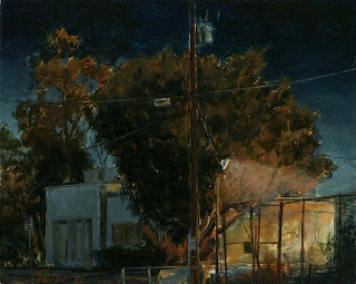
Tree Nocturne Red Curb
%22DavidJTeter.jpg)
oil on panel, 2013
2" x 2⅜" (5.08cm x 6.01cm)
For Sale at DAILY PAINTWORKS, CLICK HERE
Direct link to this painting here.
Here's a new one from my Tree Nocturne Series of an old desolate street.
Again I paint the warm glow of an orange sodium street light which plays so beautifully against the cool blue night.
Under the tree the fire hydrant hides in the shadow guarded by the red curb.241
Once again images are uploading with poor quality. I made some adjustments but a more accurate image can be found at DAILY PAINTWORKS.
This problem seems to come and go. Oh mercy!
**I have updated this post with a 'fixed' photo. This is how it should have looked in the first place.
Friday, September 6, 2013
Urban Haze

oil on panel, 2013
5" x 7" (12.7cm x 17.78cm)
I see a lot of scenes like this living near the ocean. Bright days tucked under the marine layer.
Colors intensify but are not too glaring, not like a bright clear day. All the moisture in the atmosphere affects colors in a different way, they seem to bleed softly into the air.
Even harsh environments are gently cushioned under this canopy of moist air, not quite blocked and grayed out as on foggy days. The marine layer lets the sun through just enough to let us pause and relook at what we would normally dismiss.
That's what I see and why I choose the often maligned urban setting. It would be too obvious, and easy, to take an already pretty landscape and make it prettier.240
Wednesday, September 4, 2013
Marina Towers Oceanside

"Marina Towers" SOLD
oil on panel, 2012
7" x 5" (17.78cm x 12.7cm)
I did this after a visit to Oceanside California in the late afternoon
just as the tower was beginning to drop into shadow.
I love this time of day.239
Saturday, August 31, 2013
Series - Locomotive - UPY 2760

oil on panel, 2013
5" x 7" (12.7cm x 17.78cm)
Number five in my New Locomotive Series.
This is a Union Pacific yard or a switcher locomotive on a bright sunny day.
These locomotives are used for breaking down trains, assembling trains or moving trains around, generally within a rail yard.
They are the railroads' version of a tugboat so they are built for their job; low-powered, low speed, high tractive effort, high torque. You can also see how its cab allows for 360 degrees of visibility to suit its tasks.
Not the romantic vision of streamlined trains whooshing through panoramic vistas.
They are strictly working class and get the job done with grunts and groans.(5)238
Wednesday, August 28, 2013
Series-Locomotive-BNSF 7753 Refinery

oil on panel, 2013
5" x 7" (12.7cm x 17.78cm)
This is number 4 of my New Locomotive Series.
A Burlington Northern Santa Fe locomotive passing a refinery,
emerging from a soft shadow.(4)237
*My woes I described in the previous 3 posts seems to have been remedied.
Thank you to whomever or whatever mysterious forces made the fix.
**I have updated this post with a 'fixed' photo. This is how it should have looked in the first place.
Friday, August 23, 2013
Series-Locomotive-PHL 64 Two Tree's

oil on panel, 2013
5" x 7" (12.7cm x 17.78cm)
This is number 3 of the series.
The Pacific Harbor Line is the switching railroad company that operates in the Ports of Los Angeles and Long Beach California.
This series is a lot of fun but I am also approaching it as an opportunity to experiment in various ways.
To give it some exuberance I went with brighter colors in what would otherwise be somber grays, blacks and tans of concrete, asphalt and fencing. Even the black locomotive reflects blue.
Here, the 64 rolls solo heading back towards the port of LA to work.(3)236
I am still terribly frustrated with the way images are uploading. I just can't get decent image quality.
If anyone knows why please let me know. Thank you
**I have updated this post with a 'fixed' photo. This is how it should have looked in the first place.
**I have updated this post with a 'fixed' photo. This is how it should have looked in the first place.
Monday, August 19, 2013
Series-Locomotive-BNSF 7730

oil on panel, 2013
5" x 7" (12.7cm x 17.78cm)
This is the second in my new series.
The BNSF Locomotive 7730, at the lead of a consist, in the shadow of a mountain beginning its long climb up the Cajon pass to the high desert here in Southern California.(2)235
The BNSF Locomotive 7730, at the lead of a consist, in the shadow of a mountain beginning its long climb up the Cajon pass to the high desert here in Southern California.(2)235
*Has anyone else noticed problems with the way images are now showing up on Blogger?
I drafted this post a couple weeks ago and noticed a decidedly poor image that uploaded to Blogger.
It used to be I had no problem with the image I photographed, adjusted when needed, and uploaded.
In fact it became routine.
I have adjusted this one three times, uploading different versions, and it still looks washed out and the colors are off, I still can't get a good QUALITY image!
I have some other posts drafted and they all look the same.
If anyone else knows how to fix it please let me know.
If anyone else knows how to fix it please let me know.
**I have updated this post with a 'fixed' photo. This is how it should have looked in the first place.
Saturday, August 10, 2013
Series-Locomotive-UP 4343

oil on panel, 2013
5" x 7" (12.7cm x 17.78cm)
This painting marks the beginning of my new Locomotive Series available on DAILY PAINTWORKS.
Here are a couple of UP's in the light-filled late afternoon chugging through the Alameda Corridor.
The 4343 displays the earlier graphics before Union Pacific changed to the flag.
The characteristic cad red lightening bolt still remains.
So cool.(1)234
*Has anyone else noticed problems with the way images are now showing up on Blogger?
I drafted this post a couple weeks ago and noticed a decidedly poor image that uploaded to Blogger.
It used to be I had no problem with the image I photographed, adjusted when needed, and uploaded.
In fact it became routine.
I have adjusted this one three times, uploading different versions, and it still looks washed out and the colors are off, I still can't get a good QUALITY image!
I have some other posts drafted and they all look the same.
**I have updated this post with a 'fixed' photo. This is how it should have looked in the first place.
Subscribe to:
Posts (Atom)