Sunday, December 20, 2015

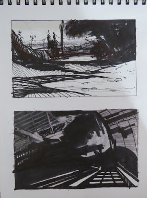
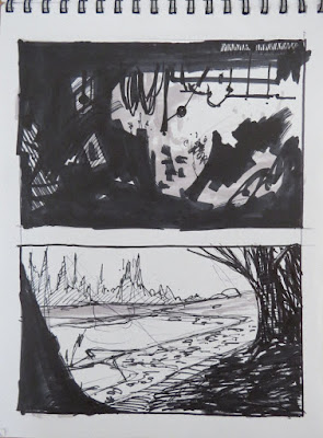
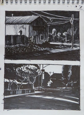
Marker Drawings 20


Sketchbook drawings
Sharpie markers bullet and fine point, Letraset Promarker Twin Tip Neutral Tone markers (cool grey 1-5 plus black), 2015
sketchbook 6" x 8" (15.24cm x 20.32cm)

Things are about to get real busy as the new year approaches! I have enjoyed the simple and immediate pleasure of drawing for its own sake but show deadlines are quickly approaching. More on that later. For now, a few more sketches.402,403,404,405,406


Sunday, December 13, 2015

Marker Drawings 19


Sketchbook drawings
Sharpie markers bullet and fine point, Letraset Promarker Twin Tip Neutral Tone markers (cool grey 1-5 plus black), 2015
sketchbook 6" x 8" (15.24cm x 20.32cm)

Working on stuff... a few more marker sketches. Light and dark and hazy.397,398,399,400,401

Thursday, November 26, 2015

Marker Drawings 18


Sketchbook drawings
ballpoint pen, Sharpie markers bullet and fine point, Letraset Promarker Twin Tip Neutral Tone markers (cool grey 1-5 plus black), 2015
sketchbook 6" x 8" (15.24cm x 20.32cm)

Hope everyone had a Happy Thanksgiving!
Back to a more black and white graphic approach. Still some tonal application but simplified.394,395,396


Friday, November 20, 2015

Marker Drawings 17


Sketchbook drawings
ballpoint pen, Sharpie markers bullet and fine point, Prismacolor Premier dual tip warm grey 40% marker, Letraset Promarker Twin Tip Neutral Tone markers (cool grey 1-5 plus black), 2015
sketchbook 6" x 8" (15.24cm x 20.32cm)

More... still enjoying it.390,391,392,393


Saturday, November 14, 2015

Marker Drawings 16


Sketchbook drawings
ballpoint pen, Sharpie markers bullet and fine point, Prismacolor Premier dual tip warm grey 40% marker, Letraset Promarker Twin Tip Neutral Tone markers (cool grey 1-5 plus black), 2015
sketchbook 6" x 8" (15.24cm x 20.32cm)

A few more... 386,387,388,389


Saturday, November 7, 2015

Marker Drawings 15


Sketchbook drawings
ballpoint pen, Sharpie markers bullet and fine point, Prismacolor Premier dual tip warm grey 40% marker, Letraset Promarker Twin Tip Neutral Tone markers (cool grey 1-5 plus black), 2015
sketchbook 6" x 8" (15.24cm x 20.32cm)

These are primarily based on one from this post, the very bottom sketch, and the overall large dark compositional shape heavy on the left and top of the picture frame.
I did various degrees of abstract imaginative to realistic in the trees. It's really about the variations of values, shapes, line, texture etc. and is a good exercise because I don't have to be so intent on making a representation of anything recognizable if I don't want to.

Working in marker also means working one direction, light to dark so I have to think very much like working in watercolors and know I can't come back and go light over dark. That itself is another good brain exercise because it means a certain amount of planning or thinking ahead while still retaining the sketch quality.

Any one of them could be developed into a representational image. The very nature of thumbnails is the abstract qualities of strong design first then seeing that through to an end.383,384,385


Friday, November 6, 2015

Marker Drawings 14


Sketchbook drawings
ballpoint pen, Sharpie markers bullet and fine point, Prismacolor Premier dual tip warm grey 40% marker, Letraset Promarker Twin Tip Neutral Tone markers (cool grey 1-5 plus black), 2015
sketchbook 6" x 8" (15.24cm x 20.32cm)


More marker sketches.381,382


Saturday, October 31, 2015

Catalina Pacific Concrete Watercolor

"Catalina Pacific Concrete (Demolition 3)"
watercolor on paper, 2015
8.5" x 15" (21.59cm x 38.1cm)
For Sale at DailyPaintWorks, click here

A slight pause from all the recent marker sketches just so you know I still paint.

Here is a recent watercolor from the ongoing Catalina Pacific Concrete series, the demolition sub-series. This sub-series focuses on the actual destruction of the neighborhood landmark. At least it had been a fixture in the neighborhood for years.

Many from the overall Catalina Pacific Concrete series are painted with a thought in mind first, with some level of realism, not rendered, but with a certain vagueness to communicate that thought.

I painted this one simply and in a stark more graphic manner reminiscent of its final demise, quietly disappearing with a final punch in the stomach. Sometimes simply stated communicates that idea better as I did with this earlier version of the plant. It is the subject being subdued.

This one is completely devoid of any real background which is lost in the mist of demolition.

If you've read my Skies post this sky too is not an afterthought. It has a similar but more subtle upheaval as this watercolor of another local neighborhood landmark succumbing to the fate of demolition. Its subtlety came from the decision to retain the stark white from the first of this sub-series "Catalina Pacific Concrete (Demolition 1)" while still showing some of the action of the de-construction.380

Friday, October 23, 2015

Marker Drawings 13


Sketchbook drawings
ballpoint pen, Sharpie markers bullet and fine point, Prismacolor Premier dual tip warm grey 40% marker, Letraset Promarker Twin Tip Neutral Tone markers (cool grey 1-5 plus black), 2015
sketchbook 6" x 8" (15.24cm x 20.32cm)

Real and imagined, abstract. Compositional value studies in black and white. In some I start by putting down darks without anything in mind, just going for shape. In the end they are suggestive, nothing literal. Good excercises to warm up otherwise I sometimes find myself working too tight. By that I mean too tight in the hand and the line that comes from it. Loose and relaxed is better in ink even when the finish is precise and tight or exact in its execution.375,376,377,378,379


Friday, October 16, 2015

Marker Drawings 12


Sketchbook drawings
ballpoint pen, Sharpie markers bullet and fine point, Prismacolor Premier dual tip warm grey 40% marker, Letraset Promarker Twin Tip Neutral Tone markers (cool grey 1-5 plus black), 2015
sketchbook 6" x 8" (15.24cm x 20.32cm)

October is INKtober. It was started by Jake Parker. 
I wasn't sure at first if it was meant only for liquid ink like india ink but have since seen some drawings in markers so I decided to post the #inktober2015 tag to any I do here in October.
Markers are ink but maybe not for the purist.

I think I will try some in india ink too. It has been a while since I have had it out and this would be a good excuse to do so.
All these here are dreamed up. Having done so many industrial paintings it wasn't a stretch for me.370,371,372,373,374

Thursday, October 15, 2015

Marker Drawings 11


Sketchbook drawings
ballpoint pen, Sharpie markers bullet and fine point, Prismacolor Premier dual tip warm grey 40% marker, Letraset Promarker Twin Tip Neutral Tone markers (cool grey 1-5 plus black), 2015
sketchbook 6" x 8" (15.24cm x 20.32cm)

Still at it.
One reason I have gone to markers recently is its quick use, uncap and draw... great for carrying around with a small sketchbook. Value laid down quick.
The top page is a couple freeway overpasses near home currently being expanded/updated. The others are from my imagination, just sketching. Shape, value, composition.367,368,369

Thursday, October 1, 2015

Marker Drawings 10


Sketchbook drawings
ballpoint pen, Sharpie markers bullet and fine point, Copic value markers, Prismacolor Premier dual tip warm grey 40% marker, Letraset Promarker Twin Tip Neutral Tone markers (cool grey 1-5 plus black), 2015
sketchbook 6" x 8" (15.24cm x 20.32cm)

The new markers.
I used up so many, the Copics especially, I had to buy new ones so I found a set of Letraset markers and the Prismacolor warm grey of which they only had the one.

In many of these I have represented the various times of day night and atmospheric effects. If you know my work I do a lot of nocturnes, rain, fog, haze etc.
It is always a matter of value control and the challenge is doing it so simply. I don't have the advantage of color and only some edge control (tonal approach) so I really have to use the 3, sometimes 4-5, values to best advantage.

I have been trying out various approaches, simple, carefully drawn, intuitive, while still keeping them sketchy and quick.

I'm using hatching, flat graphic tones, gradient tones and various combinations of these. Some are more illustrative and stylistic while others are as simple as possible, reduced to it lowest common denominator in shape and value or nearly so. The linear and hatching controls value as well as giving some visual texture to the drawings and helps define forms and perspective.
Anything goes when experimenting with technique.362,363,364,365,366

Sunday, September 27, 2015

Marker Drawings 9


Sketchbook drawings
ballpoint pen, Sharpie markers bullet and fine point, Copic value markers, Prismacolor warm grey marker, gel ink pen, 2015
sketchbook 6" x 8" (15.24cm x 20.32cm)

4 more if you have been following these recent Marker Drawings.
I used a new Prismacolor warm grey 40% on two of these. More experimenting with different techniques. I'm all over the place as far as that goes but that is the point. Just do whatever comes to mind, the very nature of sketching is searching. More on that to follow.358,359,360,361

Thursday, September 24, 2015

Marker Drawings 8


Sketchbook drawings
ballpoint pen, Sharpie markers bullet and fine point, Copic value markers, gel ink pen, 2015
sketchbook 6" x 8" (15.24cm x 20.32cm)

Still more. From life, photo, memory, imagination, whichever one happens to be working the best at the moment or best suits my temperament.
Many of these are more carefully drawn which happens to be my temperament lately. After the long stint painting oils as I do I needed to loosen up, see previous posts or hit 'Marker Drawings' LABEL.
I did, but that need to delineate always comes back, for now.
Sloooow and thoughtful. Really make conscious decisions on value control and compositional shapes.

Neither loose nor tight is better. As artists we should do both, at least in sketching and drawing. It is our Yin and Yang? It only makes us better.

I also had some fun mixing the warm and cool Copic markers on some sketches. There is a richness in tone on those I like.
I have really blown through a lot of markers doing these, including the Copic markers which are nearly dry now. I had to go out and but all new markers!
I only wish some sketches weren't duds! I look at the all that ink... and think, well, at least I know what NOT to do!351,352,353,354,355,356,357